| Graph Type |
Choose the time interval each point on the chart will represent. For instance, on a monthly candlestick chart, each candlestick will show the open, close, high, and low values for an entire month.
Choices are:
- Monthly
- Weekly
- Daily
- Minute increments of: 60, 30, 15, 10, 5, 1
- Custom Minute: Enter your own period length, up to 480 minutes
- Tick: You can choose how many executions make up a "tick." This capability enables you to get a view of a symbol's activity where time is not a factor. Each tick is simply a certain number of executions, which you specify in the number field. Studies are not available on Tick charts.
|
| Graph Style |
Candlestick
- You can choose between solid
 or hollow or hollow  candlesticks. Each candle represents one time interval chosen in the Type setting above. candlesticks. Each candle represents one time interval chosen in the Type setting above.
- A green candlestick indicates that the closing price for the interval was higher than the opening price, thus a positive movement for the interval. The top of the candle is the close price, while the bottom is the open price.
- A red candlestick indicates a downward movement in the price for the interval and the closing price is indicated by the bottom of the candle, while the opening price is indicated by the top of the candle.
- The thin line, or "wick," shows the high and low for the interval.
Bar
- On Bar charts,
 the left rung indicates the opening price of the stock, and the right rung indicates the closing/last price of the stock for the day or interval. the left rung indicates the opening price of the stock, and the right rung indicates the closing/last price of the stock for the day or interval.
- The top and bottom of the bar represent the high and low for that day or interval.
- Green indicates the security's closing price for the interval was higher than the opening price.
- Red indicates the security's closing price for the interval was less than or equal to the opening price.
Line
- Shows a simple line chart based on the Close price.
Mountain
- Shows a line chart with the space beneath the line shaded in. Also based on the Close price.
|
| Overlays |
If you wish to compare the current chart to another symbol, you can add the symbol as a line chart that will overlay on the current chart.
- Enter the symbol in the symbol field of the Overlays section of Chart Settings, and click Add, or
- Right-click on the chart and select Add overlay
- Right-click on the line so it becomes bold
- In the menu that displays, choose Edit. You can also right-click on the chart key for the overlay and select Edit.
- In the edit window, you can change the following attributes:
- Color: Click on a color to replace the color assigned by the software.
- Line pattern: Choose from solid, dotted, dashed and other line patterns.
- Weight: Choose from varying line widths.
- Location: In the Show In drop-down, choose whether to show the overlay on the price chart, in an existing pane, or in a New Pane below the chart.
- Average: Choose what price the line should show for the symbol - , , , , , , or .
- When you are finished editing, click OK.
- Right-click on the overlay symbol at the top of the chart and select Hide.
- Or you can click on the chart key for the overlay at the top of the chart window. Click again to show the overlay again.
- Right-click either on the overlay line or the overlay symbol at the top of the chart and select Remove. You can also mouse over the overlay symbol and click the X next to it.
|
| Draw |
Use the Draw panel to add trend, support, and resistance lines, text annotations, and other shapes to your chart to facilitate your technical analysis.
For a description of each of the objects you can draw on your chart, see Chart Lines and Objects.
- In the Draw panel, click the type of item you wish to draw. The options available (line style, width, and color, etc.) will display.
- If you wish, enter a name in the Label field to help you identify it on the chart.
- Make any adjustments you wish to the available settings.
- Draw your line or object on the chart.
- Click Exit Draw Mode or collapse the Chart Settings panel by clicking the "handle"
 when you're finished. when you're finished.
- Right-click on the line so it becomes bold.
- In the menu that displays, choose Edit.
- In the edit window, you can change the line color, style, weight, and any other settings associated with that object.
- To move an object to a new position in the chart, click on it to make it bold. Then click and drag the object to a new location on the chart.
- For objects that are re-sizeable, like shapes and trend lines, you will see square "anchors" that you can click on and drag to resize the object.
- Right-click on the name of the object at the top of the chart and select Hide.
- If there are multiple instances of an object, selecting Hide means all objects of the same type will be hidden. So, if you have 2 Segment Lines drawn and you chose Hide: Segment line (2), both lines will be hidden.
- Right-click either on the object or the chart key for the object and select Remove.
- You can also remove an object by clicking on it so it becomes bold, and press Delete on your keyboard.
- If you want to remove all instances of the same type of object, such as all Segment Lines, right-click on the name of the object at the top of the chart and select Remove or mouse over the name of the object and click the X next to it.
|
| Studies |
Studies use a stock's price movements, volume, and other historical information to attempt to find patterns that may indicate shifting price trends.
For details about each of the studies available in StreetSmart Edge, see Chart Studies.
- To choose from a list of all available studies, click View All Studies in the Studies panel of the Chart Settings.
- In the window that opens, click on any study to add it to the chart.
- Then, if necessary, change the study settings, such as line color, pattern, and weight, at the bottom of the window.
- Depending on whether a study works in conjunction with the price chart, some studies will automatically display on the price chart, while others will display in a separate pane below the chart. You can manually change this in the Show In field of the study settings.
- Enable Show Value to display a value label along with the study line, as well as in the Level 1 Data Bar.
- If you know what study you want to use, type the name of it in the Quick Add field of the Chart Settings panel.
- Matching choices will display and you can select the study you want to use.
- Click Add to add the study to the chart and open the study settings, where you can edit the study settings.
- Right-click on the line so it becomes bold
- In the menu that displays, choose Edit. You can also right click on the name of the study at the top of the chart or pane to access the Edit window.
- In the edit window, you can change the following attributes:
- Color: Click on a color to replace the color assigned by the software.
- Line pattern: Choose from solid, dotted, dashed and other line patterns.
- Weight: Choose from varying line widths.
- Location: In the Show In drop-down, choose whether to show the overlay on the price chart or in a New Pane below the chart.
- Period: Many studies have one or more period setting. Refer to the Chart Studies topic for each study's unique settings.
- When you are finished editing, click OK.
TIP: You can also click the gear symbol  in the Studies panel to edit a study. in the Studies panel to edit a study.
- Right-click on the study name at the top of the chart or pane and select Hide, or
- In the Studies panel of Chart Settings, remove the check next to the name of the study. You can always check it later if you want to display it again.
- Right-click either on the study line or the study name at the top of the chart or pane and select Remove. You can also mouse over the overlay symbol and click the X next to it.
|
| Colors |
Built-in Colorsets
- The software comes with Light and Dark colorsets, which you can choose from the Load Colorset drop-down and click Load to apply the change to your chart.
Custom Colorsets
- You can also customize the colors yourself. Each object for which you can change the color is listed. Click the colored square next to the object name to view your choices. Select a different color if you wish.
- Save your custom colorset by typing a name in the Save Colorset field and clicking Save.
- Load your custom colorset from the Load Colorset drop-down when you want to use it again.
Study Colors
- To change the colors of any (or several) of the studies you have open, click Study Colors.
- The View All Studies window will open and in the Selected Studies panel, you will see all your studies and symbol overlays listed. You can click on each one and change their colors (and any other settings).
TIP: You can also change a study's colors by right-clicking on the study's chart key and selecting a color from the color palette.
Apply Colors to All Charts
- If you create a colorset you like and want to apply it to every chart in the application, click the Apply Colors to All Charts button.
- The software will ask you to confirm this decision, as clicking OK will overwrite all other custom chart color settings you may have established.
- All new charts opened will have these color settings applied by default.
|
| Settings |
Market Hours
Enter the hours you want chart data for in military time (for example, 1600 for 4:00 p.m. ET).
NOTE: Beginning time can be no earlier than 0600 and no later than 0930 ET. Closing time can be no earlier than 1600 and no later than 2000 ET.
Price Scale
Values: Select Linear or Logarithmic price chart scaling.
- Linear scaling shows the price scale with fixed distance between each price increment.
- Logarithmic, or percentage, scaling will change the price scale's appearance by making the vertical spacing between two points correspond to the percentage change between those numbers. So, for instance, the vertical distance between 10 and 20 and the vertical distance between 50 and 100 will be the same. This helps provide a visual picture of charts with large vertical ranges.
Location: Choose whether to display the price scale on the left or right side of the chart.
Use Price Scale with Overlay:
- If checked, the price chart and overly will display in the same space without scaling to show the relationship between the symbols.
- If unchecked, a percentage scale will display to the left of the price chart and the chart and overlay will scale to display how they relate in terms of percentages rather than in terms of a raw price scale. This helps you more fairly compare the performance of symbols trading in different price ranges.
Line Widths
Choose the line width for the price chart. Applies to price chart regardless of chart style.
Element Display Options
- Show Time Lines: Displays the vertical grid lines corresponding to the time scale at the bottom of the chart.
- Show Price Lines: Displays the horizontal grid lines corresponding to the price scale.
- Show Chart Keys: Displays the name or symbol of any overlays, studies, or drawn objects on your chart. Chart keys display across the top of the chart and are a quick way to edit, hide, or delete the enhancements you make to your charts.
- Show Level 1 Data Bar: Displays the Date/Time, Open, High, Low, Close, and Volume for the point on the chart your mouse is pointing to.
- Show Last Trade Label: Displays last trade in the price scale in a highlighted tag.
- Show History Control: Displays the historical price timeline below the chart.
Apply Settings to All Charts
- Applies the current chart's settings to all existing charts in your application. All new charts will use these settings by default as well.
- The software will ask you to confirm this decision, as clicking OK will overwrite all other chart settings you may have established.
|
 The Chart Settings panel is accessible in the Chart tool or the Symbol Hub by clicking the arrow
  to open the "drawer" and view all the settings choices.
 For a demonstration and more information on using Charts, visit the Training page.
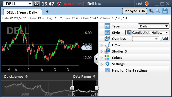
 Add a symbol overlay